
The Figma Designer Handover Trap:
Why 1920px Isn't Reality

- Written by Mila Skriptunova onSeptember 21, 2026
“I write to share practical lessons from real web development projects, from frontend architecture and responsive design.”
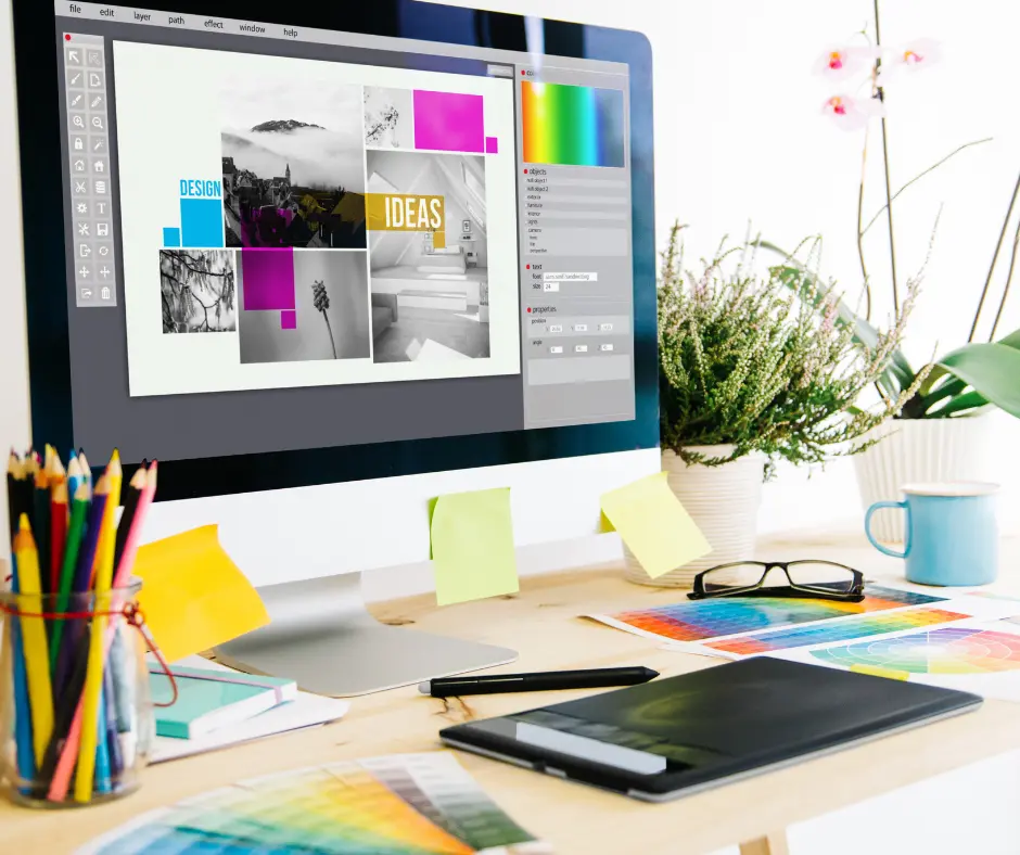
Designers often spend many long months or even consecutive years carefully crafting a truly stunning and pixel-perfect design system. The final creative vision looks entirely flawless in Figma, but it is typically presented on a massive, spacious 1920px-wide desktop canvas. 🖥️
Then comes the sobering operational reality of modern development: the engineering team faces a tight deadline to turn that grand vision into resilient code that works seamlessly across every single device, from tiny smartphones up to massive 4K displays.
The constant friction between a static design layout and the dynamic web creates an immediate crunch. So, how do you completely avoid panic while maintaining original design quality?
The secret isn’t just working harder. It is building the right development architecture right from the start.
Here is a practical, step-by-step guide to translating a detailed design system into flexible, scalable code.
1. The 1920px Problem: Don’t Just Copy the Pixels
The biggest trap starts with the source material. A frontend developer can’t simply copy the pixel values from a Figma design created at 1920px.
What looks balanced and spacious on a large desktop monitor can look oversized and awkward on a standard 1366px laptop or tablet.
✅ The solution: Don’t simply reproduce the design, translate its proportions.
Think of the 1920px layout as your maximum reference point, then build a system that scales down gracefully.
The goal is not for every device to look exactly like the Figma file. The goal is for every device to preserve the same visual hierarchy, proportions, and design intent.
Before diving into complex responsive work, make sure your baseline performance is optimized by following tips on How to Increase WordPress Memory Limit to Improve Site Speed.
2. Use a “Translation Layer” with Fluid CSS
To make a design work across different screen sizes, forget about manually adjusting everything at every breakpoint.
Modern CSS allows you to create flexible layouts that preserve the original design’s visual direction without creating dozens of breakpoint-specific rules.
✅ The solution: Use fluid typography and spacing.
Modern CSS functions such as clamp(), together with viewport units like vw and scalable units such as rem, can replace many fixed pixel values.
By defining a minimum size for mobile and a maximum size for desktop, you allow the browser to calculate an appropriate size for everything in between.
Example Code:
CSS
/* The heading smoothly grows from 32px on mobile to 48px on desktop */
.business-title {
font-size: clamp(32px, 2vw + 1rem, 48px);
font-weight: 600;
line-height: 1.1;
}
/* Section spacing smoothly grows from 60px to 120px */
.section-hero {
padding-top: clamp(60px, 6vw, 120px);
padding-bottom: clamp(60px, 6vw, 120px);
}
Instead of constantly asking, “What should this be at 1366px?”, you create rules that allow the browser to make the adjustment naturally.
That means less CSS, fewer breakpoints, and a more consistent experience across devices. If you want to expand your toolkit with reliable UI elements during this phase, check out The Best WordPress Plugin List for eCommerce Success.
3. The Ruthless MVP Triad: The Art of Choosing
Realistically, you can’t build hundreds of components, variations, and states in just a few weeks without sacrificing quality.
And trying to do everything at once is one of the fastest ways to turn a clean design system into a maintenance nightmare. 😅
✅ The solution: Be pragmatic.
Start with an immediate audit involving stakeholders and lead designers.
Apply the 80/20 rule: identify the critical 20% of UI components that are used 80% of the time.
Focus your energy on making that MVP component library as solid as possible.
Buttons, forms, cards, navigation, typography, spacing, and other frequently used components should be consistent and reliable before moving on to less common variations.
Everything else can go into the post-launch development roadmap.
4. Radical Collaboration: Synchronize in Real Time 🤝
The traditional “designer hands it over to the developer” model often fails under pressure.
A Figma file can explain how something looks, but it doesn’t always explain how it should behave.
What happens when the screen becomes narrower?
What happens when a heading wraps onto two lines?
What happens when a button label is longer?
What happens when real content replaces placeholder text?
These decisions are much easier to solve when the designer and developer communicate directly.
✅ The solution: Work together in real time.
The developer should be able to discuss questions directly with the designer, either in person or during a live call, so decisions can be made quickly.
This reduces unnecessary back-and-forth in Jira, prevents avoidable revisions, and keeps the project moving while protecting the original design intent.
Conclusion: Translate, Don’t Reproduce 🚀
Turning a detailed design vision into a working website under a tight deadline is an architectural and engineering challenge.
The goal isn’t to copy every pixel from Figma into CSS.
Instead, understand the logic behind the design system and rebuild that logic using the natural scalability of the web.
A great developer doesn’t simply ask:
“How do I make this look exactly like the Figma?”
They ask:
“How should this design behave when the screen is no longer 1920px?”
That is the difference between simply reproducing a design and actually building for the web. For deeper insights into optimizing your online footprint after launch, read our related post on Why Website Is Not Getting Clients (Even If It Looks Professional).
Optimize Your Workflow Now
Let’s collaborate to turn your Figma designs into clean, high-converting code without the handover headaches.